This is the second stanza in a poem for the city.
Stored safely in a solander box are five 13.3″ x 20″ photographs. Each printed on archival Canson Rag, and mounted on a 13.3″ x 20″ aluminium panel. Also in the box are a pair of cloth gloves for handling the prints and five written pieces. One text to match each of the prints. This writing can be framed with each work, attached to the back of each framed print. The texts will be descriptions of the images, thoughts related to each photograph, or fictional/poetic pieces.
Each print is ready for framing. or they can sit in the solander box, protected indefinitely.
This particular grouping below, in this specific print size is an edition of one. There are other sets planned, in what will be an onging series, but these specific images will not be reproduced in this size again. The dream is to produce a book with an epic amount of photographs.
Click on any image below to see a higher resolution, larger version.
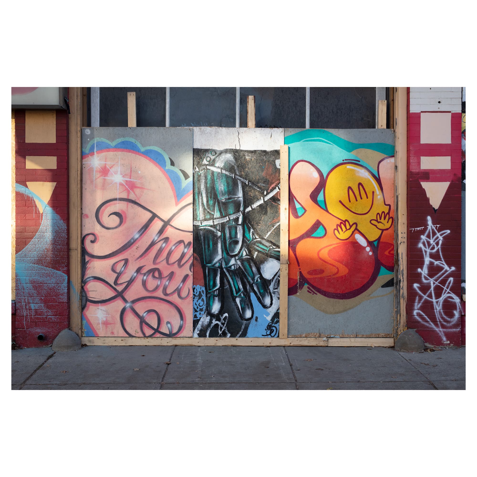
Photograph 1 – Hoarding Sunlight
The central panel of a triptych is typically twice as wide—but the same height—as each of its neighbouring side panels. These proportions allow the hinged wings on either side to swing over and completely cover the central panel, like two doors closing over an entrance. This is how a traditional triptych works. It’s usually an altarpiece.
Today the term triptych is used for more than just religious applications. Today, a triptych can refer to three panels, or three stories or songs. Really, any group of three that’s intended to be taken as one piece, or as a set of related pieces.
Because of this history, anything presented in three often echoes of the original devotional application. It’s hard to shake the original altarpiece baggage and the reverential suggestions that comes with it.
That relationship to the Trinity, and to Renaissance altarpieces, is why Hoarding Triptych feels so magical. But it’s also so beautiful because of the way the early morning sunlight falls across the picture plane and makes the colours of the mural panels so brilliant. All these things contribute to the celebratory whole.
It’s odd that an image of a derelict and boarded up car repair place should be so joyous, but it is.
Years ago you could peer through the dirty glass of the garage door to this auto shop and see the opposing door at the far end of the building. Cars could drive right through the place. There were many businesses like this in the city. Over the years these have been slowly disappearing, most likely victims to gentrification and the exponential rise in rents. They could be closing down simply because their owners are aging, and automative repair gets harder and harder to manage as engines get more complicated. Why not take the cash windfall from the sale of a building that they may have owned for decades? Maybe being a mechanic is no longer an aspirational career for a new generation of workers? Or maybe the industry in this form is a victim of the toxic masculinity that often surrounds car culture.
A few years ago there were signs this place was shutting down. You could look through the garage door windows and see the cleanup and renovation happening inside. That’s when this hoarding appeared.
On a sunny summer morning this scene was positively enchanting. The plywood paintings that were mos likely appropriated from some well-planned hoarding mural in some other location, were randomly assembled here. This recycling in itself was heartwarming, but in combination with the colour scheme of the paintings, along the optimistic tone, subject matter and the warmth of the sun, the whole package was mood altering.
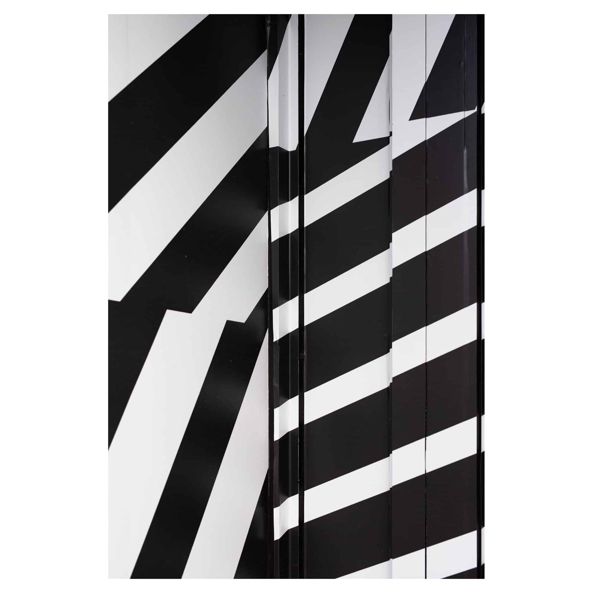
Photograph 2 – Op Art
One of the more interesting things about the city, are its everyday tableaus. The scenes that people pass by and find unremarkable. Things that never get noticed, despite being constantly in our sight-lines. The places and objects that were never meant to be on anyone’s radar. The quiet things of the city.
There’s always something to see in a place like Toronto, and the best way to see things is on foot. When walking, the more you repeat a specific journey, or the more often you retrace your steps, the more likely you’ll start to notice more of this quiet world around you. Things that hide in plain site, disguised by their humble nature, are often the very things that become fascinating and important to me.
Minimalism in art—for lack of a better term—is something I’ve always been interested in. When I was younger this included everything from Op Art, Abstract Expressionism, Colourfield, and Graphic Art to Neoplasticism and Geometric Abstraction. Now, that list has become a bit shorter, but I still love the work of; Ellsworth Kelly, Carmen Herrera, Frank Stella, Colleen Heslin, Kenneth Noland, Wanda Koop, Rita Letendre, Bridget Riley, Joseph Albers and Sol LeWitt. All of whom are related to one or more of the movements I’ve listed.
This photograph is a store front that’s been covered in vinyl film resembling the stripes of a Zebra. There were several of these “shops in progress” in the west end about two years ago. It was the marketing for a yet-to-open chain of cannabis stores called Dutch Love. They are still in business, but have limited their footprint to a dozen or more stores in British Columbia and Ontario. This was a location on Bloor west of Ossington that never materialized, and a similar location on Ossington below Dundas West also never got finished. I shot both of those spots many times.
This feels very De Stijl. It could be a coincidence, but I’ll give the proprietors credit and suggest it’s not, and that this design purposely references the Dutch art movement. De Stijl means “The Style”. The Dutch also embraced cannabis a long time ago. So the brand name and graphic design for Dutch Love makes sense.
The simple geometry of the vinyl covering drew me in. This giant sticker was installed overtop of an entire storefront. It covered the window and door jam areas and all the frames around them. The surface became a weird optical puzzle, amplified by all those changes in surface depth.
Underlying the interest in the design and graphic elements is a fascination with the cannabis industry, which has had an association with crime and illegality, despite its decriminalization. Weed is big business now for the government. Booze and drugs are always in demand. The irony is though, that many people thought this would be a cash cow, but have had to close because the market in the big cities is completely oversaturated with like-minded entrepreneurs.
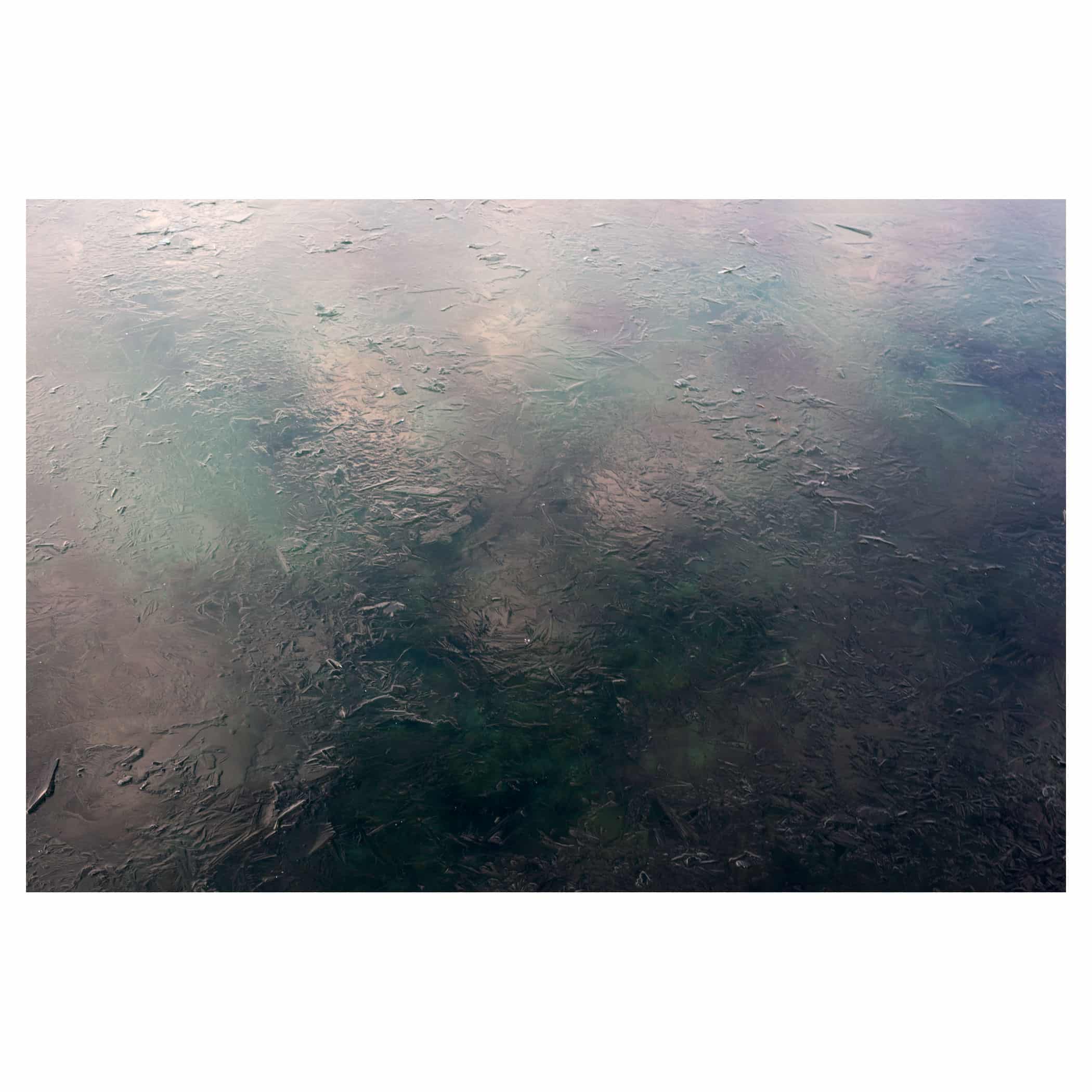
Photograph 3 – Upon Bruised Water
The magical splotches we call bruises are the aftermath of internal bleeding which itself is the result of some sort of initial trauma. Something hits part of the body, or something presses against it with force. The skin isn’t broken, but there’s damage so blood pools underneath the skin’s surface and forms a subdural haematoma. A bruise. Over time, that blood inside us is absorbed or cleared by the body and that repair processes account for the weird colour changes we see in these areas.
The analogy of the bruise works both literally and figuratively with this photograph of Lake Ontario in winter.
On a cold winter’s day, a thin layer of ice forms on the surface of the big lake. The water is not very deep here on the Toronto lake front, and the algae and stones in the shallows can be seen through that thin, clear ice layer, which also reflects the clouds and sky above. The combination of colours is spectacular in the early morning sunlight.
Every winter I’m drawn to this spot on the boardwalk that runs between The Argonaut Canoe Club and Ontario Place. In this location, winter settles in quickly. There’s a strip of water along the shore that’s sheltered from the ravages of the great lake by a few kilometres of concrete and piled boulders. It’s a man-made harbour and it’s a haven for ducks, geese, swans and other swimming birds. It’s also where a steady stream of rowers, canoe enthusiasts and paddle boarders enjoy there lake in the warmer months, protected from waves.
I love this area because the ice forms quickly in this protected area, and for the solitude it affords in winter, especially on bad weather days. Its a terribly rough place, and on days when the winds are high, temperatures are in the double digits below zero, and the snow is flying, nobody goes there. Well, nobody but me. I find it very peaceful at these times which is strange. It’s peaceful, but its also extremely dangerous and I’m very careful making my way around the ice and open or frozen water.
On certain days the break-wall can also bring me down. Not in a terrible way, but in a melancholy, thought provoking way. I long for the open water and on those occasions I have to really push myself to make the longer journey past the eastern or western limits of the break-wall, and into an area where the open lake is allowed to push against the shore directly. The sound and the fury of the water is awe inspiring. The wind and water demand respect. At times when I’m alone and the weather is dangerous, I can imagine I’m not in the city I love at all, but on some weird primeval shore, one of the first peoples or maybe one of the last.
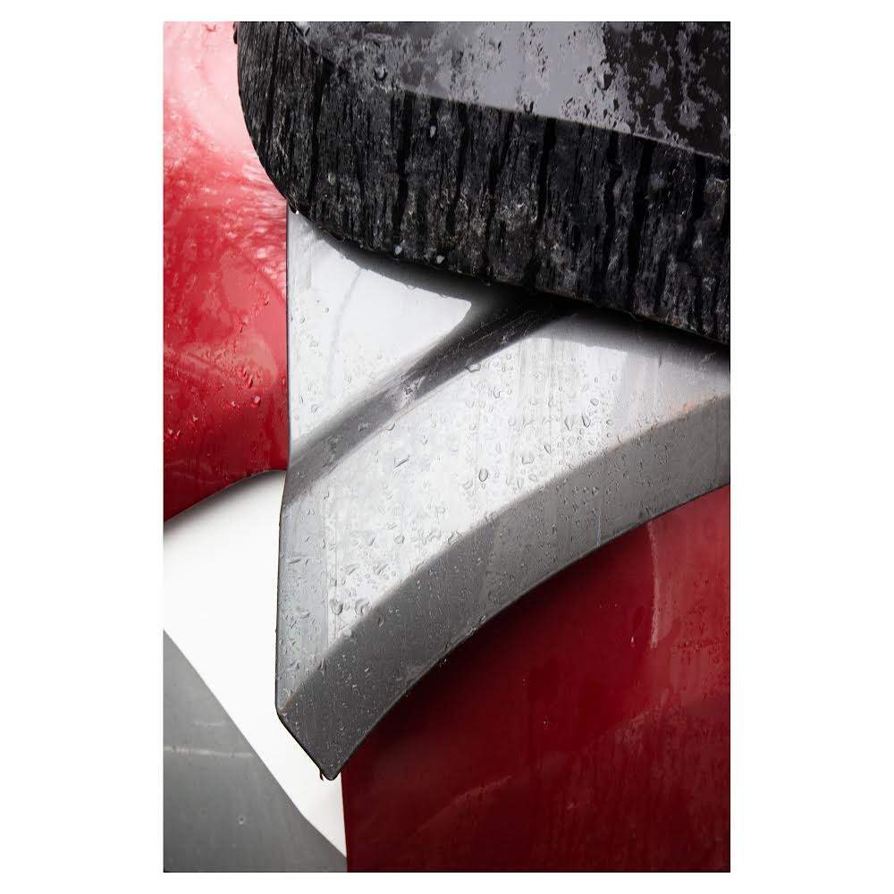
Photograph 4 – The Body Shop Totem
This is a close-up photograph of a pile of plastic bumpers. These colourful segments are the bits that hide the shock-absorbing structure on modern cars. They mask the polystyrene core and help to maintain a uniform aesthetic across the entirety of every newer vehicle. When I was a kid, bumpers were made out of chromed metal.
This pile of plastics was found heaped behind an auto body shop in the Bloordale neighbourhood of Toronto on a rainy day. If you walk around a lot, and actually looked for this type of thing, you would see it more often than you might imagine if you lived in a similar part of town. There are a lot of body shops in middle and low income areas of city and this makes sense. If you have hundreds of thousands of cars, there’s always going to be a need to repair them. Bumpers are the first thing to get damaged in an accident.
Red, black, and silver are very common colours for cars. White is another. These would all be regular, stock, car colours.
This particular pile’s shape and palette made me think about west coast indigenous art. Specifically Haida design and colour. The red, white and silver of the bumpers and their hard edged but rounded organic lines mimic some of the more commercially popular print work I’ve seen. Most of which is predominantly black, red and white.
Brian Jungen’s sculpture also came immediately to mind. One of the reasons I was drawn to this object and immediately took this photograph was because it felt like I found a naturally occurring work by the west coast contemporary artist. I would hope he could find the humour in that. I think there’s often a dialogue between indigenous culture and western commercialism in Jungen’s work, and the automobile is a pretty good representation of western commercialism.
When it’s raining in the city, its always a little quieter too. I love walking around in the rain, its another nice way to find solitude in a big place like Toronto. Inclement weather days and weekend mornings, just after sunrise, are the best for this. I can walk for hours at these times and not see many people.
I’ve also been interested in garages for years. I’ve taken many photographs of shops during off hours, through the big overhead-doors over the last few decades. There’s so much stuff in those places and their usually very organised and well lived in. I find them fascinating. I’ve often imagined a photo series to capture these rough around the edges places while they still exist. Before technology transforms these spots into hermetically sealed laboratories where only engineers work using computers and robots while wearing white lab coats.
I also like speculative fiction.
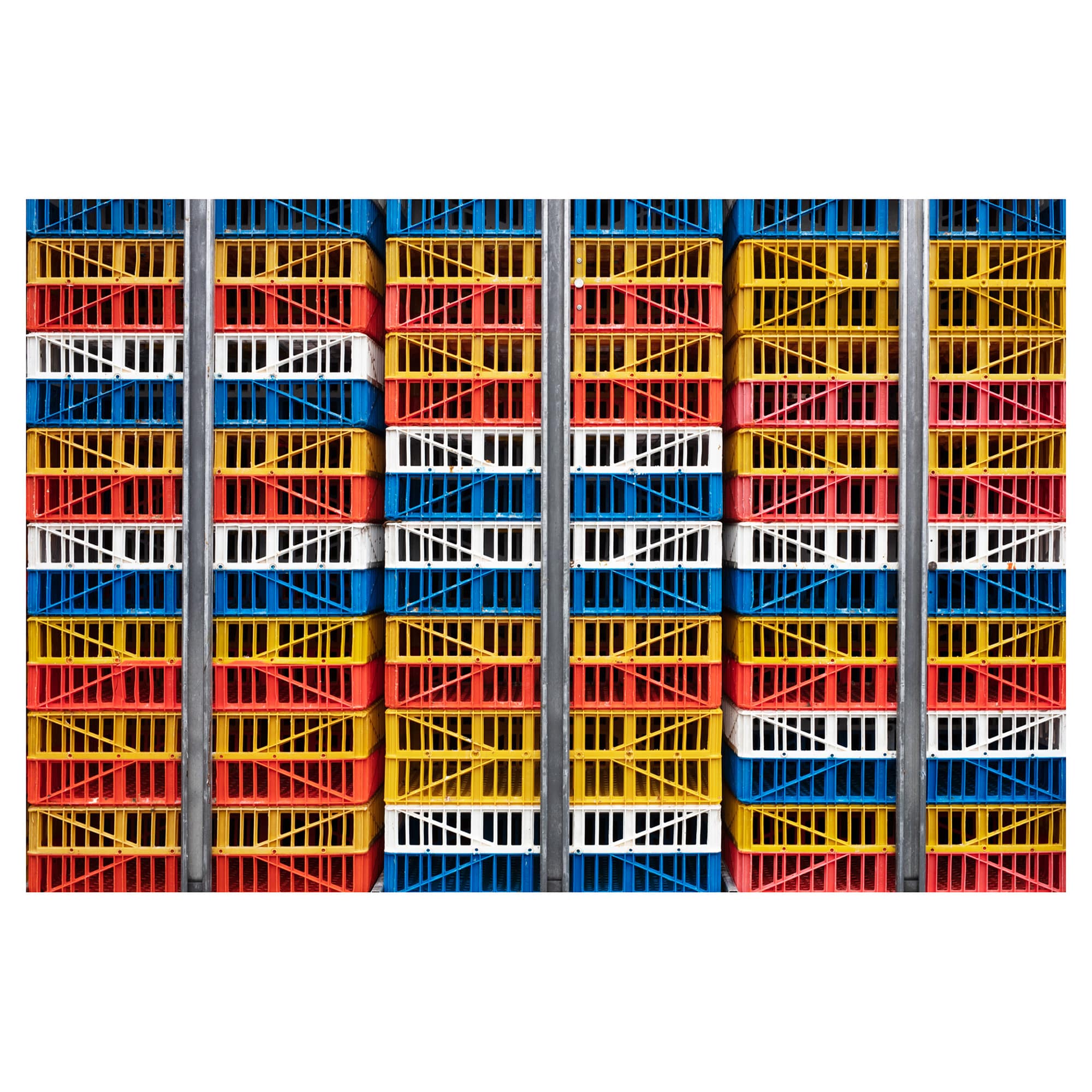
Photograph 5 – Stockyards Quilting
Sometimes things I’m drawn to have a dark underbelly. An underlying meaning that’s not the first thing I think about. There’s an aesthetic draw right away, but often, or frequently, that masks a more subtle evil.
My neighbourhood is directly adjacent to, and just a short walk away from, the area to the north west known as the Stockyards. To the south west we have Bloordale. West of us is the Junction, and south of us is Parkdale. The area I wake up in everyday is known as the Junction Triangle. The name reflects our three-sided wedge of neighbourhood delineated by three surrounding railway lines.
Despite the big city neighbourhood names and the gentrification that we’ve experienced in the last twenty years, this whole area remains working-class, and blue-collar at the core.
Inside and surrounding the Triangle are several meat processing plants, a chocolate bar factory, self-storage facility, a gelatine processing plant, a rubber manufacturer, concrete processing plant and a host of other industries that continue to operate. These gives the area its distinctly non-downtown feel. The neighbourhood bed us known as the Junction was dry (alcohol free) until just twenty years ago.
This is a photograph, taken in the Stockyards, from the edge of a parking lot for a Metro grocery, LCBO and Beer Store. These parked trailers full of empty poultry cages can be seen every day. They feel joyful because of all the colours, they’re playful. These primary colours have a positive effect on me, but they mask the frightening truth. We know where all these chickens have gone.
The Maple Leaf processing plant has been here for decades. So have all there other factories. But in the last 30 years there has also been radical change. In that period a lot of what was once industrial space, has been converted into giant retail stores with massive, suburb-like parking lots. The industry of the area has slowly but surely given way to rows of townhouses, and more recently condo buildings. Some of the meat processing industries remain, despite the smells and the negative connotations.
I’m an omnivore. But I’m very aware of that and know that I contribute to this frightening industry. There’s a degree of detachment that anyone who eats animal products maintains in order to live with themselves. When I walk past these places I imagine a world where we don’t live like this.
I find this strange sorcery present in certain photographs—this depiction of terrible things in beautiful ways—fascinating. One of my favourite artists, and a notable influence on my work for a long time, has been Ed Burtynsky. He’s spent a lifetime commenting on man’s disregard for the natural world. I’ve always thought that his artistic body of work is one of the more brilliant conceptualisation of an idea that I’ve ever seen.